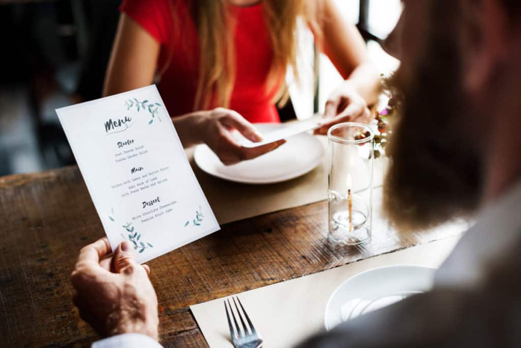
Building a restaurant menu is both exciting and terrifying. It is your chance to show your creativity and culinary prowess, but a few missteps could set your restaurant back years or, even worse, lead to catastrophe.
If only there were a list of best practices that allowed you to keep your head away from the doom and gloom of failure and instead focus on success.
Spoiler alert: THERE IS! Follow these “Do’s” and avoid the “Do Not’s” to create a menu that will start you on the path to success.
DO: Post Your Menu Online
There is no excuse not to post your menu all over the internet. This should be a no brainer. In addition to your website, display your menu on your social media accounts in addition to popular menu sharing sites.
So many potential customers use the internet to preview menus and decide where to dine. The last thing you want is to risk them bypassing your place because they can’t find a copy to peruse.
Never post your menu to your website solely as a downloadable PDF. They can be clunky and awkward to read, especially on a mobile device. Plus, nobody wants to download a file just to preview your offerings. It’s great to have the option to download a PDF copy, but it should not be the only way to access it.
On social media, utilize a high-quality JPEG or PNG for each page of your menu.
Last but not least, post your menu on menu sharing sites. The biggest menu sharing sites (outside of search engines and social media) are MenuPix and AllMenus.
DO NOT: Let the Chef Create Menu Descriptions

Chefs are incredibly talented individuals, artists even. But most, if not all, are NOT wordsmiths. Unless your chef is a professional level copywriter, do not task them to create menu descriptions on their own.
Chefs, like most restaurant workers, tend to speak their own language of industry jargon and slang. Leaving the description to the chef will result in, at best, a bland statement listing ingredients and, at worst, a confusing mess that creates more questions than it answers.
Hire a professional copywriter to help with the menu descriptions. Your chef (or yourself) can be heavily involved in the process by submitting details about the ingredients or preparation process, but let the professionals handle it from there.
Professional copywriter pricing can vary depending on experience, but do not skimp here. Review their portfolio before investing a few hundred dollars. If capital is limited, consider using a site like fiverr to hire an amateur whose work displayed is of high quality.
Longer, better-written menu descriptions are more enticing to guests and therefore stand a better chance to sell. Length matters when it comes to explaining what is in your dishes. Not including a description at all is a major mistake!
Don’t be afraid to “get cute” with your menu descriptions, especially in the opening line. A fun story or clever pun about the item can draw attention to the dish.
DO: Train Your Entire Team Comprehensively on the Menu
Your entire front of house team should be masters of the menu. Take the time during training to teach them everything about the whole menu. Do this with every customer-facing member of your team, which includes servers, bussers, bartenders, hosts, and front of house managers.
Before being allowed to work solo, your employees should be able to name the ingredients in every dish and be able to describe how it is prepared. I would even go so far as demonstrating how the items are made and let them sample it. It might seem costly, but this attention to detail will result in fewer mistakes over time, eventually paying for itself.
Regularly administer tests (either verbal or written) to your team to ensure they are up to speed with your menu. Anytime you add a special dish means that you need to take some time and train them before they can hit the floor and sell it. Not to sound corny, but knowledge is power!
DO NOT: Have too Many Items on Your Menu

If your menu resembles a small Bible, IT’S TOO BIG! Your goal might be to have plentiful choices and something for everyone, but it will instead be overwhelming. The psychological principle known as “The Paradox of Choice” shows that increased choices lead to feelings of anxiety rather than the intended goal of providing options.
I’d be remiss to say there is a flip side to this argument. Having a menu that is too small can decrease a guest’s frequency. The goal is to find a sweet spot somewhere in the middle.
There is not an exact science as to the “perfect” number of items a menu should have, but many believe that seven is the perfect number per category (appetizer, entrée, etc.). Using this “rule of seven” allows you to have some variety while also keeping the menu manageable.
Menu items that are not popular should be cut or rotated regularly to make room for new things that might sell better. A restaurant’s menu is the most precious customer service document; don’t waste its real estate with dishes that don’t sell.
DO: Highlight High Margin Items
Your menu should highlight the most profitable and unique dishes. By highlighting the dishes with the highest profit margin, you are subliminally suggesting them to your guests, which ultimately leads to you making more money per head.
The best way to highlight profitable items is to position them strategically in the menu. There are certain parts of the menu that customers are naturally drawn to first. These areas are where you should be listing the dishes you want to sell the most. That is, they have the highest profit margin or are simplest to prepare.
Guests usually start by looking at the middle of the page, then scan up to the top right and finally the top left in a triangle pattern. For this reason, the center, top right, and top left parts of your menu represent the most valuable “menu real estate.”
The middle of the page (the first part of the triangle mentioned above) is the most valuable. This is where most people’s eyes naturally gravitate first, much like the eye-level shelf at the grocery store (which is often used to display items they are trying to push). Since entrees account for more than half of your total sales be sure to use the middle area to list your them.
Your most expensive, high-quality entrée should be featured prominently, front and center. Beneath it should be an entrée that is less costly for cost-conscious customers to pivot towards. This allows you to get a nice mix of orders for both your expensive signature dish and your highest margin dish. It is a bonus if the signature dish is also high margin.
Utilize the top left for appetizers with the highest margin items listed first. Putting your appetizers in this area also makes sense from a “flow” standpoint.
The bottom left is an area that people will often skip unless they are looking for a particular section. This is the perfect spot for a kids menu or to list your side dishes.
You can use pictures to draw attention to items you want to sell more frequently, but you need to be careful not to overdo it. There should never be more than one photo per page. If you would classify your establishment as high end or fine dining, skip the photos all-together.
Another way to draw attention to a specific high-profit dish is to separate it visually from the rest of the dishes in the category. Draw a box around this item or leave larger margins surrounding it to make it stand out. This sends the message that this dish is unique, thus deserving extra space and signaling that it should be ordered. The white space also naturally calls attention and pulls the eye towards it.
DO NOT: Have Items that are Clones of Your Competitors
Create your menu without trying to come up with “your version” of a competitor’s signature dish. While this does not apply to all recipes, signature dishes should be unique and copying too closely will seem petty. This will also simultaneously not differentiate yourself enough for a prospective guest to want to visit.
Be bold and be unique. That does not mean that you shouldn’t offer chicken parmesan because your competitor does. It means that you shouldn’t offer chicken parmesan prepared the same as your competitor. Make yours different, better, and describe it compellingly on your menu.
DO: Utilize Color Theory

Designers and artists utilize colors to evoke emotions and to tell a story. Even if you are not an artist, you can use color theory in your menu to conjure feelings as it is read. Different colors have different psychological effects on the reader. The most common are as follows:
Yellow: This is one of the two most common colors used in restaurant menus. Yellow grabs attention and draws our eyes. Yellow is not great as a font color, but used in a paler, inconsistent tone, like marbled manila, works great as a background color.
Red: Red stimulates our appetite and is the second most common color used in menu design.
Blue: Blue has a calming effect and can invoke images of the ocean, making it useful in selling seafood. Some feel that the calmness might be a detriment from happy customers leaving raving reviews, but I think that is overthinking things.
Green: Green can be used to sell more salads and vegetables.
Be careful not to overdo it with color. Your menu should not be a rainbow after all, and using too much color will make it look like amateur hour.
DO: Use Decoy Items
Decoy items are expensive dishes placed prominently to make the rest of the dishes price seam more reasonable. For example, if you are a steakhouse, put the $250 Wagyu steak near the top, and the other $50 steaks suddenly seem like a bargain. It’s all about perspective.
You can also use this tactic to get customers to gravitate toward a smaller portion of the same item but with a higher margin. So, for example, if you have a 10oz filet minion priced at $50, you can create a smaller filet option of 4oz for $30.
DO NOT: Rush the Editing Process
There is nothing more embarrassing than a customer pointing out a typo in the menu. It will hurt much more once you remember what you paid to have them printed (and will now have to pay for a reprint!)
After your “final” draft is complete, send it to a friend with an eye for detail to edit it. Then send it to another friend, and then another. Continue this process until three friends find nothing wrong with it. The alternative to this is to pay an editor a few hundred bucks to go through with a fine-toothed comb. If you can afford it, go the route of the professional.
One part of editing a menu that you won’t see mentioned very often is to send a copy to your lawyer. Have your lawyer review the men and ensure there is nothing that could potentially cause you trouble. Given the different regulations regarding menu labeling, allergen identification, and uncooked food notices, having a lawyer who is an expert in business law review your menu is worth its weight in gold.
When my dad opened his diner in 1989, he made a pretty severe rookie blunder. He had a fried chicken dish on his menu and named it “Kentucky Fried Chicken.” It sounds like a pretty silly mistake, but his recipe (which was nothing like KFC’s) was based on traditional southern fried chicken, and he just overlooked that he was infringing on a copyright.
The result of this mistake? It had to be eliminated from the menu. Because it was such a shoestring startup, he could not afford to have the menus reprinted. Instead, he and my mom sat down in a booth and used a sharpie to cross out “Kentucky” from the menu. It looked even worse than it sounds. Don’t. Rush. Editing.
DO: Update Offerings Regularly
Have you ever noticed that chain restaurants of all types have a habit of updating their menu multiple times per year? They do it to keep their current customers happy with variety as well as draw in new customers.
The paradox of choice tells us to keep our menu reasonably sized but not so small as to limit variety. Rotating the menu allows you to avoid overwhelming customers while also offering a variety of different dishes throughout the year. It also gives an opportunity to eliminate unpopular items from the menu that are just wasting space.
Updating your menu regularly means you also have the opportunity to update your pricing. Given the volatility of food costs, this flexibility allows you to adjust your pricing with current events that might be affecting overall costs.
At the very least, change the menu twice a year. Ideally, update it seasonally to showcase dishes that utilize seasonal ingredients like strawberries and watermelon in the Summer or squash and pumpkin in the Fall.
DO: Allow for Flexibility
If your menu is one piece and expensive to print, you are stuck with it until your next update. Carryout menus are especially susceptible to this problem. Instead, create a menu that allows you to add specials or makes it easy to add printable inserts.
Holidays like Mother’s Day, Father’s Day, and Valentine’s Day are perfect times to offer specials. Having the ability to run specials can also be a means to an end. If you have excess ingredients that you are worried about spoiling, you can run a limited-time dish just to use up that ingredient.
I recommend investing in high-end menu holders with self-printed pages instead of professionally printed menus for your dine-in customers. Go with either leather or wood. I prefer wood holders because they are so durable and unique. You can find some nice options on Etsy or commission a local woodworker to make them at a surprisingly affordable price.
Once you have a great “shell” you can use quality resume paper to print your menu in-house and BOOM, you have a sophisticated looking menu that is also very flexible. For carryout menus, avoid the temptation of buying them in large batches even though the price per menu is lower in larger print runs.
DO NOT: Draw Attention to the Price

One of the biggest mistakes I see with menus are the way pricing is structured. I am not talking about the price itself, rather the way it is reflected on the menu. A great menu consists of dishes with creative names, well-written descriptions, and is easily scannable. This allows the diner to select an item based on appeal rather than what is the best value.
From a design standpoint, the worst thing you can do is have a separate column for pricing. The dotted lines that lead to the price column are tacky and draw attention away from your dish and focuses on the price instead. It also allows the guest to simply scan for the cheapest item rather than the one they would enjoy the most.
Avoid using dollar signs in your menu. Using a dollar sign on one item facilitates the need to use them on all items. All those dollar signs can make a patron subconsciously associate words like expensive and greedy with your restaurant.
The idea of pricing something that ends in $.99 is relevant but will appear tacky if you are a higher-priced restaurant. If your fast-casual and serving sandwiches, then by all means price your sandwich at $9.95 instead of $10. But, if you are the steakhouse I keep referencing in this article, you will look silly pricing your steak at $49.95.
My favorite alternative is to simply include the price at the end of the description, two spaces after the period using the same font. This keeps the price front and center without calling attention to it. The end result is the customer pays less attention to the price.
The above suggestions lineup with a study conducted by the Center for Hospitality Research at Cornell University. The study concluded that people are willing to pay considerably more for food that does not include a dollar sign. The same study states that people are generally apt to spend more money when the price is written out as opposed to being listed numerically.
DO: Understand the Impact of a Well-Designed Menu
A well-designed menu can impact your business at multiple levels. The look and feel of the menu tell customers a story about what they can expect from your establishment. The pricing gives guests an idea of the quality and ambiance. The layout helps you establish a profitable menu mix, and the condition serves as testimony to how well the restaurant is maintained.
In short, a well-designed menu will consistently increase your revenue and profits. Don’t skimp on time or money when you are putting the menu together. Take your time to make sure it is done right.
DO: Remember, Size Matters
Using a font that is too small is a common complaint amongst patrons. Combined with dim lighting, small fonts are difficult to read and can be frustrating. Alternatively, a font that is too large can come off as tacky. You want to use a font size somewhere in the middle.
The menu itself should be sized appropriately as well. It should be big enough to find your menu correctly but not so big that it takes up most of the table. It also needs to be light enough that the guest does not feel like they are doing curls reading the menu. Remember that, especially if you opt for a wood menu.
DO NOT: Have Multiple Menu’s
I went to a restaurant recently that had SIX separate menus. They included the following:
- Lunch Menu
- Dinner Menu
- Happy Hour Menu
- Drink Menu
- Dessert Menu
- Kids Menu
The irony: You could order from any menu at any point of the day except for the happy hour menu. Mind. Blown.
Having too many menus will only confuse guests and employees. If you feel the need to have menu items that can only be ordered at specific parts of the day, then utilize inserts instead of separate menus.
The only exception is if you have a small drink and or dessert menu that you keep at the table.
Summary
In the end, your menu is the most important document that your customers see. It is also the most crucial piece of marketing material. Think about it: it is the only marketing material a customer will purposely seek out before deciding to dine with you. You won’t see them Googling your slogan or billboard to select where to eat, just your menu.
Your menu represents your brand by default, so ensure that the representation is the one you want on display. The material you print on, the design, and the color patterns you use are all part of how your restaurant will be perceived.
The condition of your menu is also important. It doesn’t matter how amazing your menu is if it’s sticky or has encrusted ketchup stuck to the back cover. Every customer should receive a menu as if it is brand new.
Remember, your menu sets the tone for the rest of the experience. Do everything you can to set a tone of warmth and hospitality. It’s the first step of creating a memorable meal and experience that will set your restaurant apart from the competition and help find success.