Many restauranteurs feel confident and focused when coming up with recipes and setting prices but then stumble when they reach the time to put it together and design the actual menu. Luckily, you don’t need to be artistically skilled to build a beautiful looking menu thanks to the many different programs that will do the heavy lifting for you.
How do you design a restaurant menu? The easiest way to design a great-looking menu is to use a graphic design program with built-in restaurant menu templates. If you are looking to build a menu from scratch, Adobe Spark is your best bet. To completely outsource design, Smart Menu Design will design and print your menu in under a week.
| Top Pick: Must Have Menus | 4.7 / 5 |
| iMenuPro | 4.2 / 5 |
| Canva | 3.6 / 5 |
| Adobe Spark | 3.4 / 5 |
Using a template through a graphic design program is the best option unless you are insistent on having a uniquely designed menu or have a vision in your mind of what you want to create.
My favorite software program to design menus is Must Have Menus. iMenupro and Canva are both fantastic alternatives, but in my opinion, they fall just short of Must Have Menus. All three programs are excellent resources for designing a functional and aesthetically pleasing menu, I just personally like Must Have Menus the best.
All of these programs can create an exquisite menu and share many of the same features. With that said, each has its strengths and weaknesses. Below you will find my review and more information that will help you decide which program is best for you.
Must Have Menus
Started in 2007, Must Have Menus is a website focused solely on menu management. Using this website platform, you’re able to design and print menus in addition to all sorts of other marketing materials that you might need.
Must Have Menus has a very modern, sleek, and easy-to-understand interface. It breaks down the design into six steps. You start by choosing your design template, followed by your size, and then you add in all the copy (text containing menu items and descriptions). With Must Have Menus, you add each menu item into separate boxes that then get inserted into the draft to prevent you from losing any of the menu item information during edits.
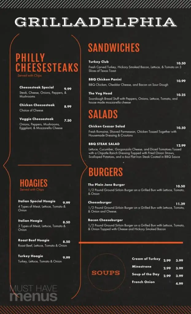
Once you have inputted all the information about individual items on your menu, you’re able to add custom graphics, customize the fonts, customize the colors, and adjust spacing. Finally, you can take advantage of my favorite feature – the ability to easily highlight select items using a custom font, colors, and graphic effects like boxes to make them stand out from the rest of the menu.
In terms of design, options Must Have Menus offers a nice variety of over 3,000 total design templates, 1,000 of which are just for menus. You’re also able to set up social sharing, easily link menus to your website, and download hi-resolution copies directly from the program. Your layout options are vast and include templates for both inhouse and carryout menus.
Another impressive part of Must Have Menus is that you can order the print copies directly from them rather than using another vendor for printing. Eliminating this step reduces the risk of error and simply saves time.
Print prices vary depending on what you need to be printed and quantity, but are comparable with most National printing services. You might be able to find a better price at a local print shop, but I recommend that you go with Must Have Menus printing to ensure quality and save you some time.
Must Have menus is not cheap. The first three months are just $12.95 per month, but after that, the price jumps to $29.95. If you choose to bill annually, the price is only $276 a year, which works out to $23 per month. The good news is that you can cancel at any time and there’s no contract. Also, your menus won’t be deleted if you cancel your account. I think that the features of Must Have Menus justify the higher price tag.
The one thing that is missing from Must Have Menus is the ability to print poster size menus that can hang on menu boards. Hopefully, this is something that gets added in the future.
| Interface | 5 / 5 |
| Design Options | 5 / 5 |
| Learning Curve / Ease of Use | 4.5 / 5 |
| Download & Print Services | 5 / 5 |
| Price | 4 / 5 |
| Final Rating | 4.7 / 5 |
iMenuPro
At first look, iMenuPro does not seem user-friendly and looks outdated. After a quick minute of experimenting, it’s evident that there is so much more to this program than meets the eye, thanks to a drag and drop style builder. Similar to Must Have Menus, but unlike Adobe Spark and Canva, iMenuPro is designed with menu design as the primary function rather than being an afterthought add on.
The layout is different than most of the other menu builders. Rather than an interface similar to those of graphic design software, iMenuPro reminds me more of writing or scripting software thanks to its ability to add menu items, descriptions, and prices one at a time before coming up with a layout. Since each menu item exists in its own box, it’s simple to move things around with ease.
One of the unique features of iMenuPro is the ability to sync your menu from their website to yours without posting it as a downloadable PDF. This is done through embedding a small snippet of code, which is (I promise) far easier than it sounds. This sync also works with your social media accounts which is convenient as a time saver.
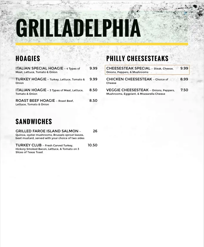
iMenuPro does not stop at simple menus. You are also able to create menu posters, folded takeout menus, and many more types of marketing materials featuring your menu. You can even go high tech design digital menu boards to display on television monitors.
iMenu pro features over 3,500 designs and graphics, giving you a seemingly endless supply of options. If that were not enough, you are also able to upload custom pictures or logos. Thanks to the drag and drop layout along with a feature called “Magic Fit,” making your menu and graphics fit appropriately is easy. After completing your menu, you can even easily experiment with different color combinations thanks to their color filters.
From a pricing standpoint, iMenuPro is going to be challenging to beat. It is currently priced at $15 a monthly for a subscription that drops to $9.75 a month if you pay annually. If you plan to make a few updates per year, that price is fantastic. If you are building a “one and done” style menu, you have a full month to complete it for $15 as there are no cancelation fees or long term contracts.
The only drawback to iMenuPro is the lack of incorporating print options. To print your menu and marketing materials, you are going to have to either own a quality printer or send it to a local print shop. While this creates an extra step, it does not stop iMenuPro from being awesome.
With an easy to use interface well suited for amateurs or the artistically challenged (like me) in addition to the numerous design and sync features mentioned above, iMenuPro is my top pick for designing a standard menu.
| Interface | 4 / 5 |
| Design Options | 4 / 5 |
| Learning Curve / Ease of Use | 5 / 5 |
| Download & Print Services | 3 / 5 |
| Price | 5 / 5 |
| Final Rating | 4.2 / 5 |
Canva
Canva is my go-to website for pictures and building graphics. Unfortunately, when it comes to menu design, they just don’t compare quite as well to the competition.
Looking through their templates, I felt they looked generic and tried to make up for it with extra color. While none of the menus were ugly, I just didn’t find any that looked modern. While there are some usable templates, I found very few that had the professional, minimalistic look that I prefer.
If you find a template that you like, Canva comes at a fair price. Many of the templates can be made and downloaded for free. For some of the better templates, it’s going to cost you a few bucks plus a month of a subscription. Building a menu for under $20 would not be an issue with Canva.
One thing I love about Canva is its Print Service. I have used them before to have posters printed for events, and I have been very impressed with the ease of ordering, print quality, and turnaround time.
Canva’s design software is intuitive and quickly learned, but not as easy to use as iMenuPro. Unless you are experienced with Canva, expect a short learning curve that you go through as you design your menu.
If you do find a template that you like in Canva and have the time or experience to modify it, then, by all means, go for it. As a subscriber, I highly recommend them as a company; I simply feel that there are better options for building a menu.
| Interface | 3 / 5 |
| Design Options | 3 / 5 |
| Learning Curve / Ease of Use | 3 / 5 |
| Download & Print Services | 4 / 5 |
| Price | 5 / 5 |
| Final Rating | 3.6 / 5 |
Adobe Spark
Adobe, the company behind software giants such as Photoshop and Premier, tout Adobe Spark as the perfect program for designing a menu from scratch. They even claim it to be easy for a beginner. As somebody who is not artistic at all, I am highly doubtful of their claim that anyone can make the menu with ease. Adobe’s other digital products are known for their high quality and flexibility, but they are not known for their quick learning curve.
That said, there are some significant advantages to having a 100% uniquely designed menu. You can design your menu so that it complements your brand as well as your food and your decor. A completely custom menu will also help your establishment stand out from the competition. By building from scratch, you don’t run the risk of it looking generic.
It should be noted that Adobe also has menu templates available. Before going through the process of building a design from scratch, take a look through the templates and see if there’s anything that catches your eye.
If you are dead set on having a menu that is 100% unique or if you just can’t find a template that matches the vision you have in mind for your menu, then Adobe spark is the best tool to help you design your menu from scratch.
Considering the amount of work that goes into opening a new restaurant, taking the time to design a menu from scratch graphically is probably not a wise use of resources. Take advantage of one of the templates here in Adobe spark if you didn’t like any of the ones that I talked about earlier.
| Interface | 4 / 5 |
| Design Options | 5 / 5 |
| Learning Curve / Ease of Use | 1 / 5 |
| Download & Print Services | 2 / 5 |
| Price | 5 / 5 |
| Final Rating | 3.4 / 5 |
Outsourcing Menu Design
If you can fit it in the budget or you just don’t like the way the templates are turning out for you using the suggested programs above, then consider hiring a professional menu design company. This is not going to be a cheap option menu, but if you want the best, sometimes you have to pay for it.
Smart Menu Designer is my recommendation for professional menu design. They have a turnaround time within one week and do the printing for you as well.
They offer a variety of pricing options ranging from $69 up to $599 based on size and options. They even provide a money-back guarantee. I have personally never used Smart Menu Design, but I have talked to others who have, and they are happy with the results.
Menu Display Options
After designing and printing your menu, it’s time to figure out how you want to present it to the customer. This is dependent on the type of restaurant you’re running and your personal preferences. For example, if you’re running a pizza restaurant, a trifold carryout menu and menu boards are a great way to present your menu to customers. If you are full service, regardless of where you fall in the range of hole in the wall diner to a high-end fine-dining restaurant, you’re going to want to have some sort of menu cover.
Here is my top pick for menu covers that are professional, high quality, and features a customizable cover.
3 Page Tri-Fold Menu Cover (8.5″ x 11″) $36.99 (Each)
4 Page Menu Cover (8.5″ x 11″) $26.49 (Each)
4 Page Menu Cover (8.5″ x 14″) $28.99 (Each)
6 Page Menu Cover (8.5″ x 11″) $46.49 (Each)
6 Page Menu Cover (8.5″ x 14″) $48.49 (Each)
3 Page Slim Beverage or Dessert Menu Cover $27.99 (Each)
Plastic Sheet Protectors (Size Dependant) $19.59 (50 Pack)
These menu covers will set your restaurant apart from the competition by having your branding on them. They are not a cheap investment, but since they are covers, they should last you for many years.
If that price is too high or you just don’t care to have them customized, then I sourced some other options for you at three different price ranges: economy, mid-tier, and luxury. All three of these are more than acceptable, depending on the type of restaurant you are running. Remember, they won’t have any custom branding outside of what’s printed on your menu itself.
Economy
The generic clear menu holder that you see listed below is the one you usually see in lower end family dining restaurants. This is more than acceptable if that’s the price point of your food.
If you want to step it up a notch and you only have a one-page menu or if you have a high-end menu and you’re trying to shoestring the opening on a budget, consider using the wood menu holders. The only downside here is that it’s a single page, but it does have a level of elegance to it, even if it is not real wood.
Generic Clear Menu Cover $4.39 (Each)
Single Page Wood Color Menu Holder $4.99 (Each)
Middle of the Road
These menu covers are made of faux leather are quite adorable. Unfortunately, the front cover of all of these will not have any of your brandings and instead just saying “menu.” If that is okay with you, I think you’ll enjoy these options.
Two Page Black Leather (Non-Customizable) $14.79 (Each)
Two Page Brown Leather (Non-Customizable) $21.99 (Each)
Luxury
If you have it in the budget to pay for a high-end menu, then I highly recommend you go with one of the custom options above. But, if you’re in a rush and don’t have time to wait for a custom menu to be made, this menu cover that only holds two pages is a great alternative.
Two Page Cork Menu Holder (Non-Customizable) $29.95 (Each)
Common Menu Design Mistakes
Even if you use one of the beautiful looking menu templates in the above programs, you still run the risk of committing a design mistake in the menu. Here are eight things to be sure to avoid as you put your menu together.
Mistake #1: Haphazard Layout
Your menu should be laid out logically by meal. Don’t have a menu that starts with desserts than in the middle has appetizers or even beverages only to end with entrees. On the other hand, don’t start with entrees thinking that, since they are your most profitable menu items, you should list them first. Lay your menu out logically in the order in which the customers are going to want to order their food.
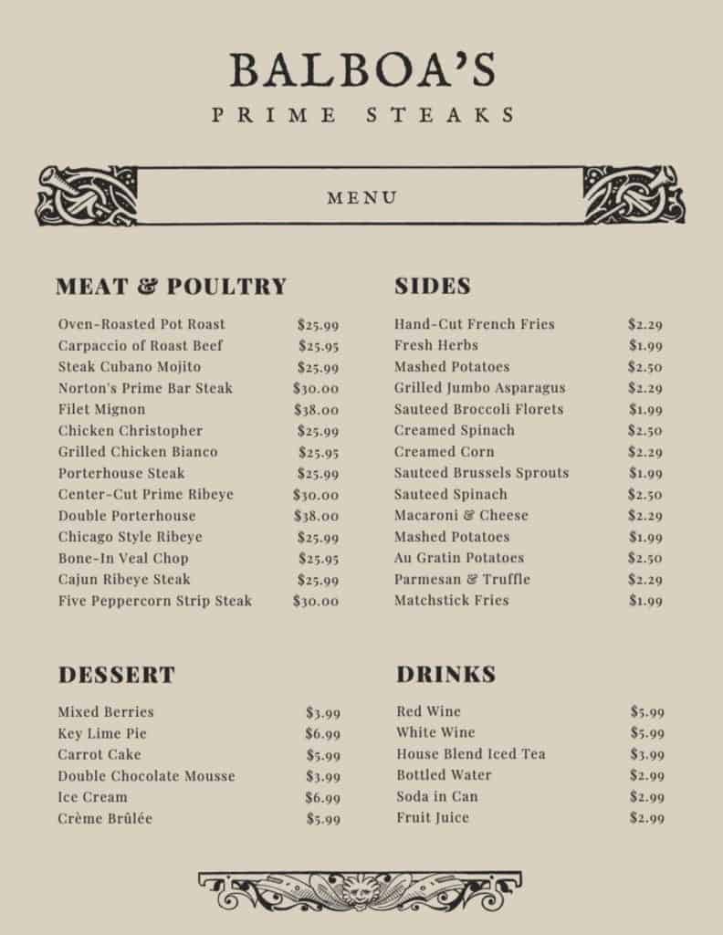
Start your menu with appetizers. That way, they can get them ordered when they’re hungry and want to get something in the kitchen right away. Next, list the entrees and end it with desserts. Beverages are the only thing that should be put in a non-logical spot (the end) since they often have their menu.
Mistake #2: Misuse of Photos
Be very careful when using photos. Generally, customers correlate an abundance of pictures with a lower quality restaurant. As the number of images per page goes up, the perception of the restaurant goes down. This is why you don’t see very many fine-dining restaurants with menus plastered in pictures.
Always use pictures sparingly. As a best practice, one per page is more than enough.
Be very careful with the quality of the photos you select. Unless you have some skills and the equipment to take professional quality photos, hire somebody to do it for you. Using poor quality photos or, even worse, stock photos will make your menu appear unprofessional at best and at worst, give your customers unrealistic expectations due to false representation.
Mistake #3: Drawing Too Much Attention to Price
Prices are important to customers, sometimes so important that they don’t focus on looking at the menu and instead choose a dish that is the best price as opposed to what they want. Drawing too much attention to price only makes this worse.
One common mistake I often see is the use of periods to line up a column of prices. By having your prices laid out in this way, your customer’s attention is drawn to them and subliminally encourages them to order a cheaper menu item.
Additionally, consider writing out the word of the price rather than using numbers. Include it in the description using the same typeface. You want to be clear about your prices, but you also don’t want to draw unnecessary attention.
Mistake #4: Getting too Cute with Typography
Be very careful you don’t get too cute with your choice of font or color. There’s a fine line between fancy and unprofessional. Your menu should have the same font throughout or the same combination of fonts. Consistency is crucial in design.
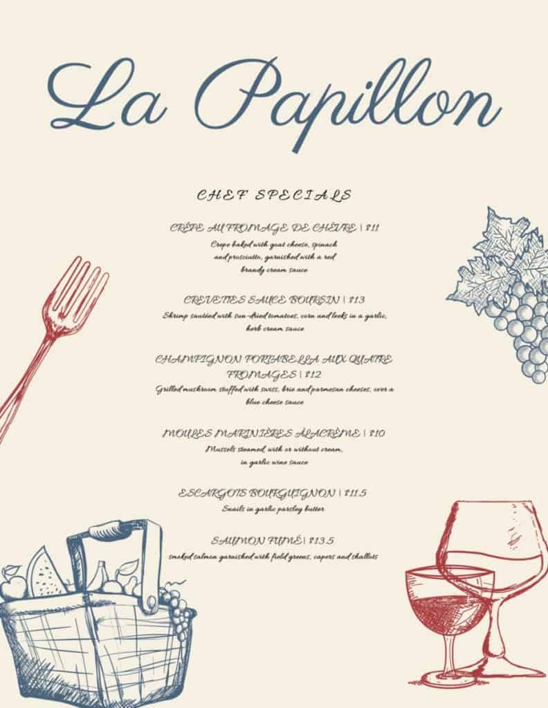
You also want to be careful with color. When you start using multiple font colors and typefaces, you run the risk of your menu, looking more like a ransom note than an actual menu.
Mistake #5: Failure to Spell Check
Considering the spelling errors that occasionally get published on this website, I feel like I am throwing rocks at glass houses saying this, but be sure to have your menu proofread and repeatedly spellchecked before sending it to print.
There is nothing more painful than having to stomach throwing out $500 worth of menus because you spelled the word mozzarella wrong.
Invest some money into having your Lawyer proofread your menu as well. They can go through and access if there is any wording or misrepresentation within your menu that could potentially lead to someone filing suit against you. This is probably an unnecessary step, but I tend to be risk-averse in business, and I highly recommend the same.
Mistake #6: Using Colors that Clash
Here I am again throwing rocks at glasshouses. I feel like I literally just figured out how to dress in matching clothing without consulting my wife, but here I am, about to preach the use of matching colors.
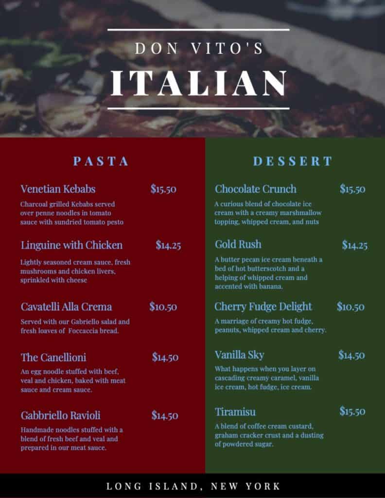
The colors of your menu need to be selected carefully to balance the color palette. You don’t want to use colors that clash with each other. Use this color palette tool to help confirm that your color palette looks good. If you feel like the colors are off in any way, they probably are.
Mistake #7: Compromising on Print Quality
Getting menus and other marketing materials printed is not cheap. It’s tempting to use a print shop that’s offering a price that is too good to be true. Don’t take the risk. This is one of those things where it makes sense to pay for quality.
The quality of your menus and marketing material says a lot to your customers about the quality of your restaurant and the legitimacy of your business.
Mistake #8: Too Much Noise
Just like clothes, graphic design has elements that go in and out of style. Right now, the style leans towards minimalism. Don’t stuff your menus with too many pictures, words, graphics boxes, or anything else that makes it look cluttered. You want your menu to appear clean, neat, and concise.
